|
Group: Forum Members
Last Active: 2 Years Ago
Posts: 17,
Visits: 338
|
Hello , I was wondering if it is possible to produce a plot , with Nevron , similar to this : 95% of original size (was 531x448) - Click to enlarge 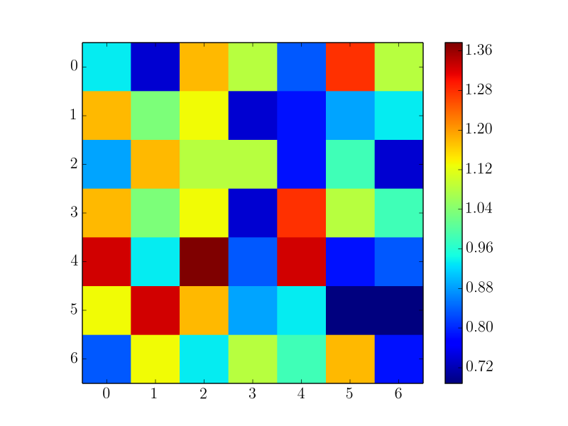 The labels on the x and y axes will refer to the indices of entries of a matrix . The matrix contains values that are represented as the square blocks of colour ( discretely ) with a corresponding colour bar . Each axis label should be displayed from the midpoint ( not corners ) of the block edges , as shown in the above picture . Being able to reverse the ordering on the y - axis would be ideal too . Any help is much appreciated . Best regards , Connor Rourke ( Software Engineer at SMT ) ( Sent from my colleague ' s account since your Register button is not currently working , at least from our end .)
|
|
Group: Forum Members
Last Active: Last Month
Posts: 3,055,
Visits: 4,052
|
Hi Stuart , Yes you can easily produce this plot . There are two options : 1 . You can use the Heat Map series ( check out " Chart gallery \ Heat map " examples ). 2 . You can use a NRangeSeries by adding ranges that correspond to each square in the heat map grid & nbsp ;( check out " Chart gallery \ Range " examples ). We hope this helps - let us know if you meet any problems or have any questions .
Best Regards,
Nevron Support Team
|


