| | Grid surface charts are a type of data visualization that represents three-dimensional data, where data points are organized in a grid.
The data points in each row and column in the grid share the same x and z values, whereas the y value is specified per data point.
A variation of the grid surface allows the user to specify a color for each data point thus adding a fourth dimension to the plot.
This type of chart is often used to visualize continuous functions or data sets that vary across an area of interest, such as terrain data, surface temperature data, and others. |
| |
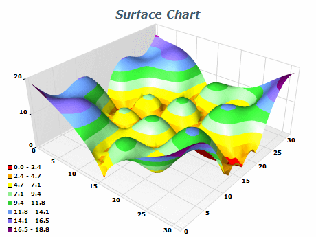 | The Grid Surface chart displays a surface with user-defined elevation values for each data point and with X and Z coordinates from a rectangular grid. With the Grid Surface chart, you can create visualizations of 3D dimensional data which have many applications in the areas of geography, engineering, physics, and others. |
|
|
This image demonstrates wire frame surface rendering. The surface filling is disabled and the frame style is "Mesh" - this way only mesh lines are displayed. | 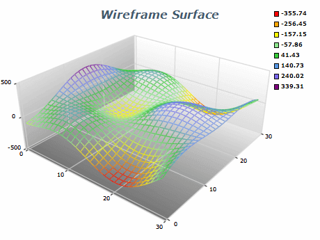 |
|
|
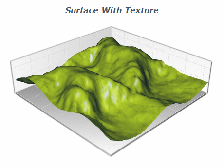 | The Grid surface series offers a range of customizable FillEffect options for the surface, including images, gradients, advanced gradients, and patterns. Additionally, users can modify material properties such as Specular Color, Emissive Color, and Shininess to achieve their desired visual effect. This image shows a grid surface chart with applied texture. |
|
|
This example demonstrates a contour chart displayed with the Grid Surface Series. Below - the surface is rendered in flat mode and above - with the actual surface elevation. This surface render mode allows you to easily create heat maps in 3D and use them as underlays or overlays of other 3D content. | 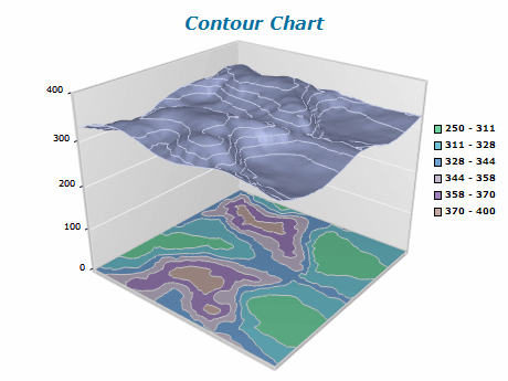 |
|
|
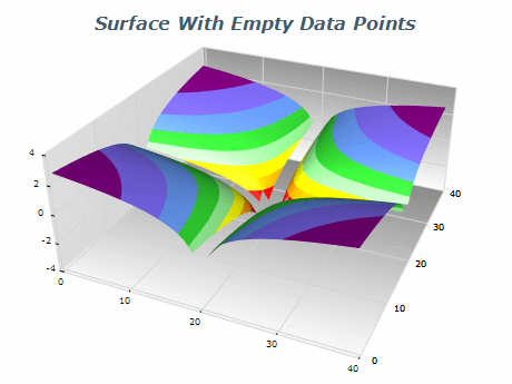 | Empty data points is a feature allowing the grid to contain areas that do not contain valid data and therefore should not be rendered. |
|
|
This image demonstrates a contour chart displayed with the Grid Surface Series. The chart uses orthogonal projection with camera elevation of 90 degrees, the lighting is disabled and the surface is rendered in flat mode. | 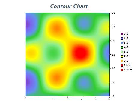 |
|
|
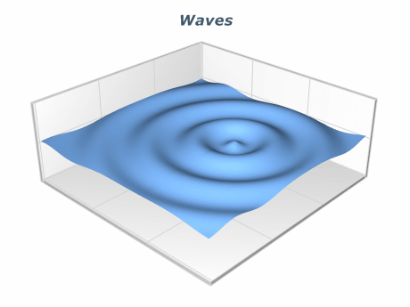 | Here the Grid Surface chart is used to represent waves. |
|
|
| X Value | Y Value | Z Value |
|---|
| 0 | 0 | 2.2 | | 0 | 1 | 1.8 | | 0 | 2 | 1.4 |
The table contains data points represented by X and Y values indicating their respective positions on the chart. The Z value signifies the data value or elevation for each point. By utilizing this data, you can generate a Contour Surface Chart that displays contour lines indicating the value or elevation of the data at each point on the chart.
|
Surface charts are a great way to visualize data in three dimensions, making it easier to identify patterns and relationships. Here are some Best Practices for Using Surface charts effectively:
- Choose the right chart type: Surface charts are ideal for visualizing data with variable elevations and regularly spaced X/Z coordinates. If the data does not meet these criteria you can consider using the Mesh or Triangulated surface charts.
- Use appropriate lighting: Lighting can significantly impact the appearance of Surface charts. Use lighting that highlights the important aspects of the data, such as areas of high or low value that don't obscure any important details.
- Simplify the data: Mesh Surface charts can contain millions of data points, and rendering such an amount of data points, especially interactively is very computationally expensive. You can use various methods to simplify the rendered data set like binning or clustering, which are built into the chart.
- Use appropriate labeling: Labeling ensures the viewer understands the presented data. Label the axes and provide a legend explaining the meaning of any color schemes used in the chart.
|
|