| | Bar series are used to display data ranges, where each range has variable end point and all ranges in the series originate from a common starting value, called
the origin value. This value is typically 0 but can be configured to be any arbitrary value. There are many different variations of the bar chart that differ by the
number of values supplied to the chart (for example XY scatter bars), the way bar series are grouped (for example stacked, stacked percent, and clustered bar charts),
and the orientation of the bars – for example, horizontal bar chart.
|
| |
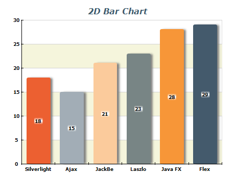 | The 2D categorical bar chart is probably the most commonly used charting type. This particular bar chart image shows a bar chart with applied image effects such as soft bar shadows and glow effect on the bar labels. |
|
|
Nevron Chart fully supports 3D bar charts. On this image a categorical bar chart in 3D is displayed. The bars use a smooth bar shape and have a lighting effect for increased visual appeal. | 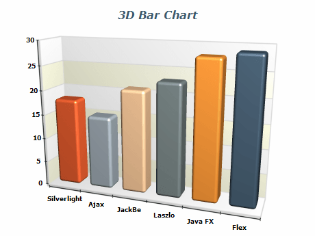 |
|
|
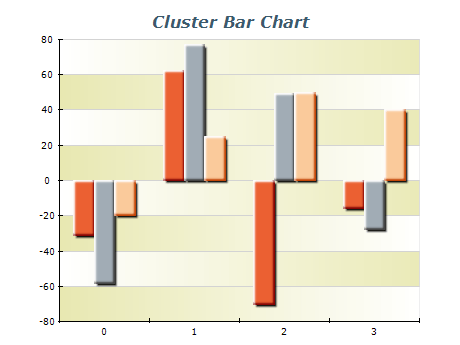 | Cluster bar charts allow visual comparison between corresponding values of synchronized data ranges. Nevron Chart supports cluster bars with both positive and negative values. |
|
|
Stacked bar series provide the capability to present data in cumulative sections and their totals. | 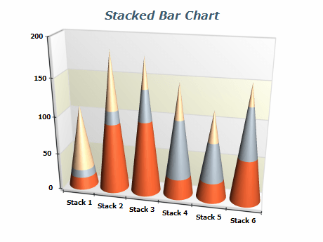 |
|
|
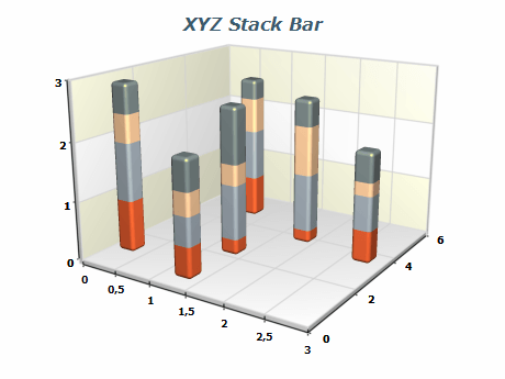 | This image shows a bar chart that uses XZ Scatter bars, that in addition have stacked bar series. |
|
|
Using multiple categorical bar series in 3D makes it easy to create Manhattan Bar charts. Those types of bar charts are perfect for comparing different items over a period of time or a number of categories. | 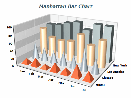 |
|
|
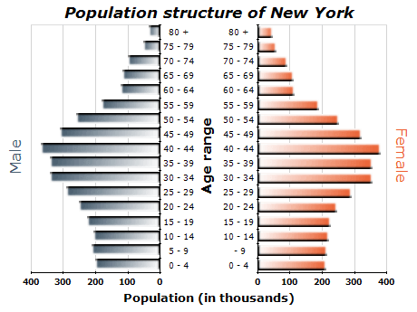 | Horizontal orientation of the bars is required in many practical applications of bar charts. This particular sample demonstrates the use of horizontal bar series in multiple charts positioned within the same canvas to display the difference in population structure between males and females in NYC. |
|
|
Clustering and stacking may be combined in the same chart. In a 3D scene, clustered and stacked series may be distributed in different depths. | 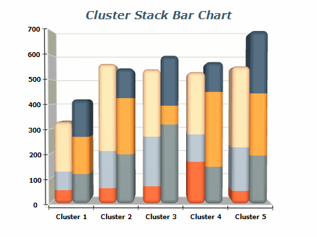 |
|
|
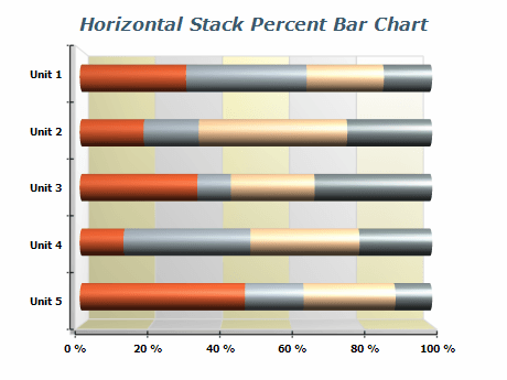 | Stacked-percent bar charts are a type of stack bar that represents the contribution of data series in each category to the total. |
|
|
This image shows a bar chart that uses XZ Scatter bars, that in addition have stacked and clustered bar series. | 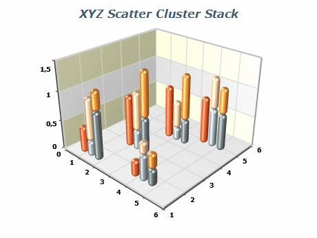 |
|
|
| Item | Quantity |
|---|
| Product A | 50 | | Product B | 80 | | Product C | 120 | | Product D | 70 | | Product E | 90 | | Product F | 110 | | Product G | 60 | | Product H | 100 |
In this sample, the table shows the quantity of each product. The item names are listed in the first column, while the corresponding quantities are listed in the second column. This table can create a vertical bar chart, with the item names on the x-axis and the quantities on the y-axis.
Each product's quantity will be represented by a vertical bar, making it easy to compare the quantities of different products.
|
-
Keep it simple: Use a simple and clean design for your bar chart.
Avoid adding too many colors or other design elements that can distract from the data.
-
Choose the correct type of bar chart: There are many different bar charts, such as stacked, grouped, horizontal, etc. Choose the type that best suits the data you are trying to visualize.
-
Label your axes: Always label the x and y axes to clarify what the data represents. Include units of measurement, if applicable.
-
Provide context to the data by including a title or subtitle explaining what the chart represents and any meaningful information relevant to interpreting the data.
-
Order your bars: Order your bars logically, making it easy to compare data. For example, you may want to order bars alphabetically or chronologically by size.
-
Use appropriate scales: Choose an appropriate scale for your y-axis. This will depend on the range of values you are visualizing.
-
Highlight important data: Use color or other visual elements to highlight important data or trends. For example, you may want to use a different color for the highest bar in a group.
-
Avoid clutter: Avoid cluttering your bar chart with too much data. Suppose you have a large amount of data to present. In that case, it may be beneficial to consider using a combination of multiple charts or alternative visualization types to display the information more effectively.
|
|


