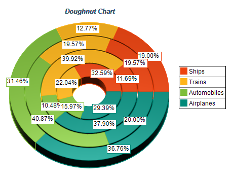
Make sure the data is suitable for a pie chart
When considering whether to use a pie chart, it's important to ensure that the data is suitable for
this type of visualization. Pie charts are designed to show how a whole amount is divided into distinct
parts and are most effective when the data is categorical, and each category represents a portion of the
whole. It's also important to remember that the primary objective of a pie chart is to compare each group's contribution to the whole, as opposed to comparing groups to each other. If your data doesn't fit these criteria,
choosing a different type of chart or visualization may be more appropriate.
Include annotations
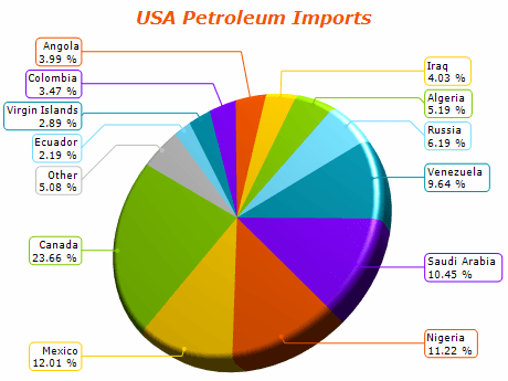
Annotations are a crucial element in pie chart visualization as they provide precise information about
the proportion of each category level. Pie charts can be challenging to interpret accurately, especially
for not easily recognizable values such as small fractions. Additionally, pie charts often lack tick marks
to estimate values directly from slice sizes when depicting amounts rather than proportions. Annotations
help overcome these challenges by clearly understanding the data presented in a pie chart.
Consider the order of slices
Arranging the slices in a logical order can enhance the comprehensibility of a pie chart.
Typically, the slices are ordered from largest to smallest, especially when categories have similar
values. However, if the categories have a natural order, it is recommended to arrange the slices
accordingly. In addition, it is advisable to start the slices from a cardinal direction, either from
the right or the top, which are the conventional directions for measuring angles. Although starting
from the top may seem more intuitive, given how we read from top to bottom and view time progression,
starting from the right is mathematically grounded.
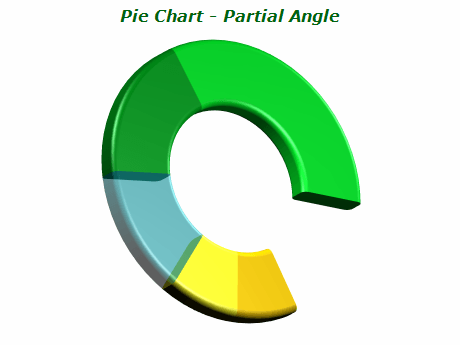
Avoid distorting effects
To ensure an accurate interpretation of a pie chart, it is crucial to maintain the correct area,
arc length, and angle for each slice. It is essential to avoid any distortions that could misrepresent
the data. Specifically, it is recommended to prevent 3D effects that could stretch or squish the circle
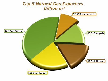
and create unnecessary depth, as this can skew the size comparison of each slice. Another potential
distortion to avoid is using "exploded" pie charts, where slices are pulled out from the center to
emphasize specific data points.
This can make it difficult to accurately determine the part-to-whole comparison due to gaps in the chart.