| | A pie chart is a very popular data visualization type used to represent the distribution of values relative to a total value.
The chart is depicted as a circle divided into slices, each representing a different category. The size of each slice in a
pie chart is proportional to the percentage of the total each category represents, thus allowing viewers to understand the
contribution of categorical values to a total quickly. A variation of the pie chart called Donut can be created by adding
multiple pie series to a pie chart.
|
| |
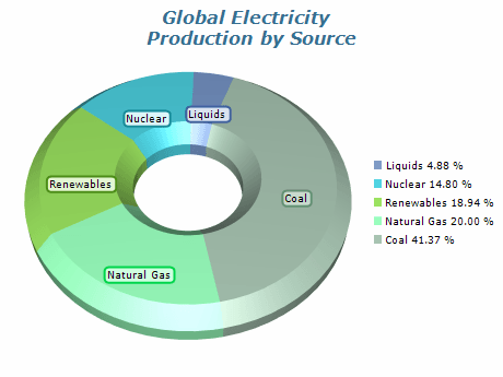 | Pie charts visually represent the relative contribution of each value to a total sum. This particular pie chart displays the contribution of different energy sources to the total energy production in an electrical grid. The chart is a variation of the donut chart as it has a hole in the center, in addition, a cut edge pe segment shape is used for better visual impact. |
|
|
Pie chart Torus mode is a variation of the traditional pie chart that displays the data in a circular shape with a hole in the center, creating a donut-like appearance. The center hole can contain additional data or labels, while the outer circle still displays the relative values of the different categories. | 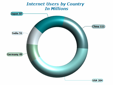 |
|
|
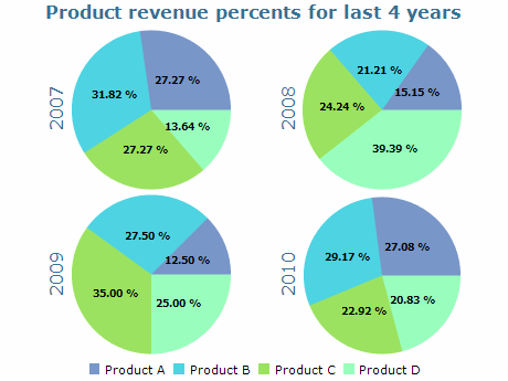 | Multiple pie charts are a way of displaying related data sets together. This type of visualization helps compare data sets side by side or analyze trends over time. Viewers can quickly identify similarities and differences between the data sets using multiple pie charts. However, it is crucial to remember that too many pie charts can be overwhelming and confusing to interpret. To ensure clarity, it is recommended to limit the number of pie charts used and to use consistent colors and labeling across all charts. |
|
|
Exploded pie charts are charts where individual sectors are separated from the center for emphasis. They are available in 2D and 3D modes and can be sorted in ascending or descending order. The labels are displayed at the rim of the pie, and the smooth edge mode enhances the visual quality of the chart. |  |
|
|
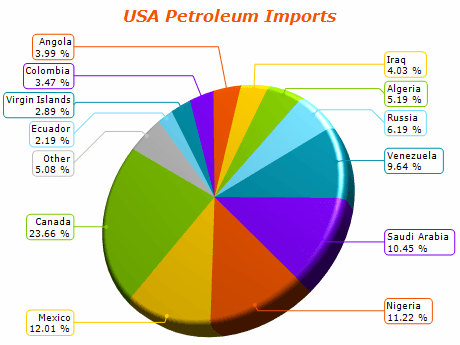 | The Non-Overlapping Labels mode helps to automatically position pie labels so that they do not overlap and are positioned within the chart panel boundaries. This greatly improves the chart's readability by ensuring users can properly interpret all values in the pie chart. |
|
|
Partial-angle pie charts display only a portion of the 360-degree circle, which can help highlight a specific category or segment. The angle can be adjusted to any value, allowing for chart customization. This mode includes various labeling options for clear data representation, including center, rim, and spider modes. | 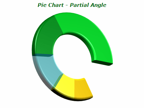 |
|
|
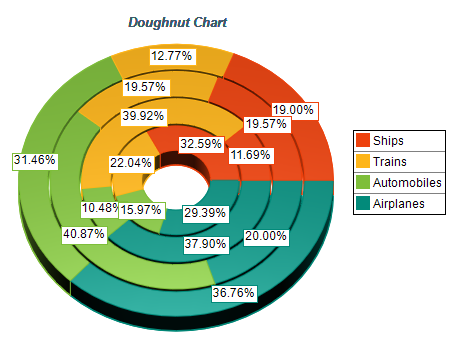 | A doughnut chart (also spelled donut) is a variant of the pie chart, with a blank center allowing for additional information about the data as a whole to be included. |
|
|
| Item | Sales |
|---|
| Apples | 150 | | Bananas | 75 | | Oranges | 100 |
The data shown represents the sales of three distinct fruits: apples, bananas, and oranges.
With 150 units sold, apples had the largest overall sales of the three fruits.
Bananas are available in 75 units, whilst oranges are supplied in 100 units.
With this data, a pie chart that displays the sales of various fruits can be created.
|
Make sure the data is suitable for a pie chart
When considering whether to use a pie chart, it's important to ensure that the data is suitable for
this type of visualization. Pie charts are designed to show how a whole amount is divided into distinct
parts and are most effective when the data is categorical, and each category represents a portion of the
whole. It's also important to remember that the primary objective of a pie chart is to compare each group's contribution to the whole, as opposed to comparing groups to each other. If your data doesn't fit these criteria,
choosing a different type of chart or visualization may be more appropriate.
Include annotations
Annotations are a crucial element in pie chart visualization as they provide precise information about
the proportion of each category level. Pie charts can be challenging to interpret accurately, especially
for not easily recognizable values such as small fractions. Additionally, pie charts often lack tick marks
to estimate values directly from slice sizes when depicting amounts rather than proportions. Annotations
help overcome these challenges by clearly understanding the data presented in a pie chart.
Consider the order of slices
Arranging the slices in a logical order can enhance the comprehensibility of a pie chart.
Typically, the slices are ordered from largest to smallest, especially when categories have similar
values. However, if the categories have a natural order, it is recommended to arrange the slices
accordingly. In addition, it is advisable to start the slices from a cardinal direction, either from
the right or the top, which are the conventional directions for measuring angles. Although starting
from the top may seem more intuitive, given how we read from top to bottom and view time progression,
starting from the right is mathematically grounded.
Avoid distorting effects
To ensure an accurate interpretation of a pie chart, it is crucial to maintain the correct area,
arc length, and angle for each slice. It is essential to avoid any distortions that could misrepresent
the data. Specifically, it is recommended to prevent 3D effects that could stretch or squish the circle
and create unnecessary depth, as this can skew the size comparison of each slice. Another potential
distortion to avoid is using "exploded" pie charts, where slices are pulled out from the center to
emphasize specific data points.
This can make it difficult to accurately determine the part-to-whole comparison due to gaps in the chart. |
|