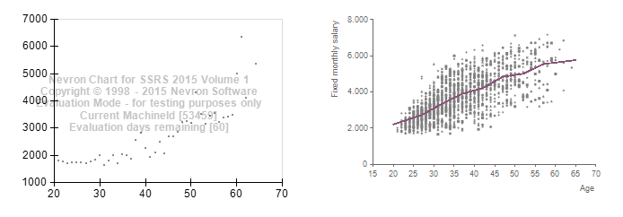
My dataset returns almost 2000 rows.
A Microsoft scatter chart plots all those 2000 values.
The Nevron XY scatterchart just plots 30?
Chart Area: Sub Type: XY Scatter
Cluster Mode: Disabled
1 Value field: Y= Fields!Measure.Value, X= Fileds.Age.Value
1 Category field: Group By: Fields!Age.Value
See screenshot below, both charts side by side and based on the same dataset. Right is default SSRS scatter chart.
73% of original size (was 694x19) - Click to enlarge
